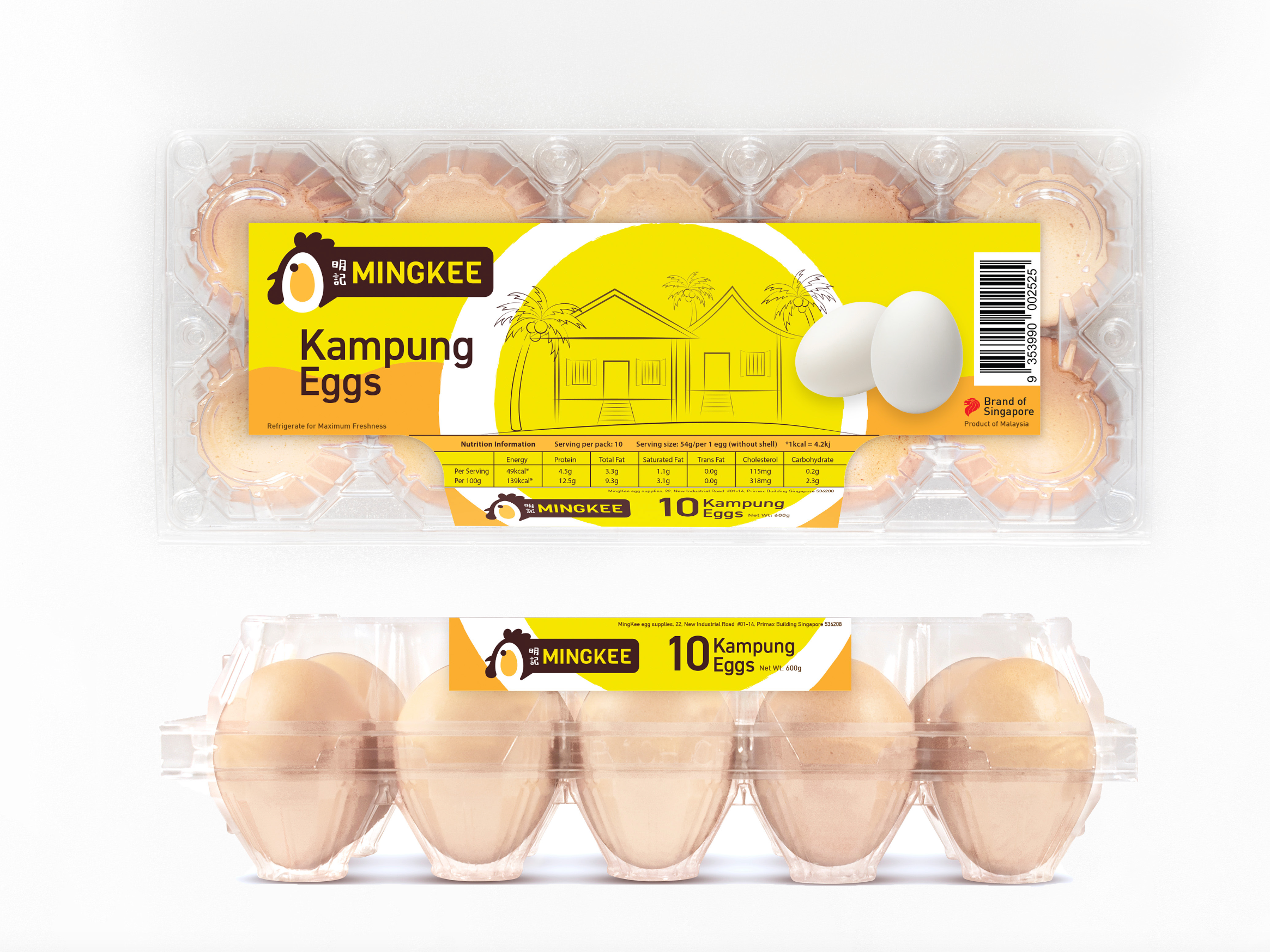
This is a project done during my internship at Orientdesign
(https://orientdesign.com.sg/)
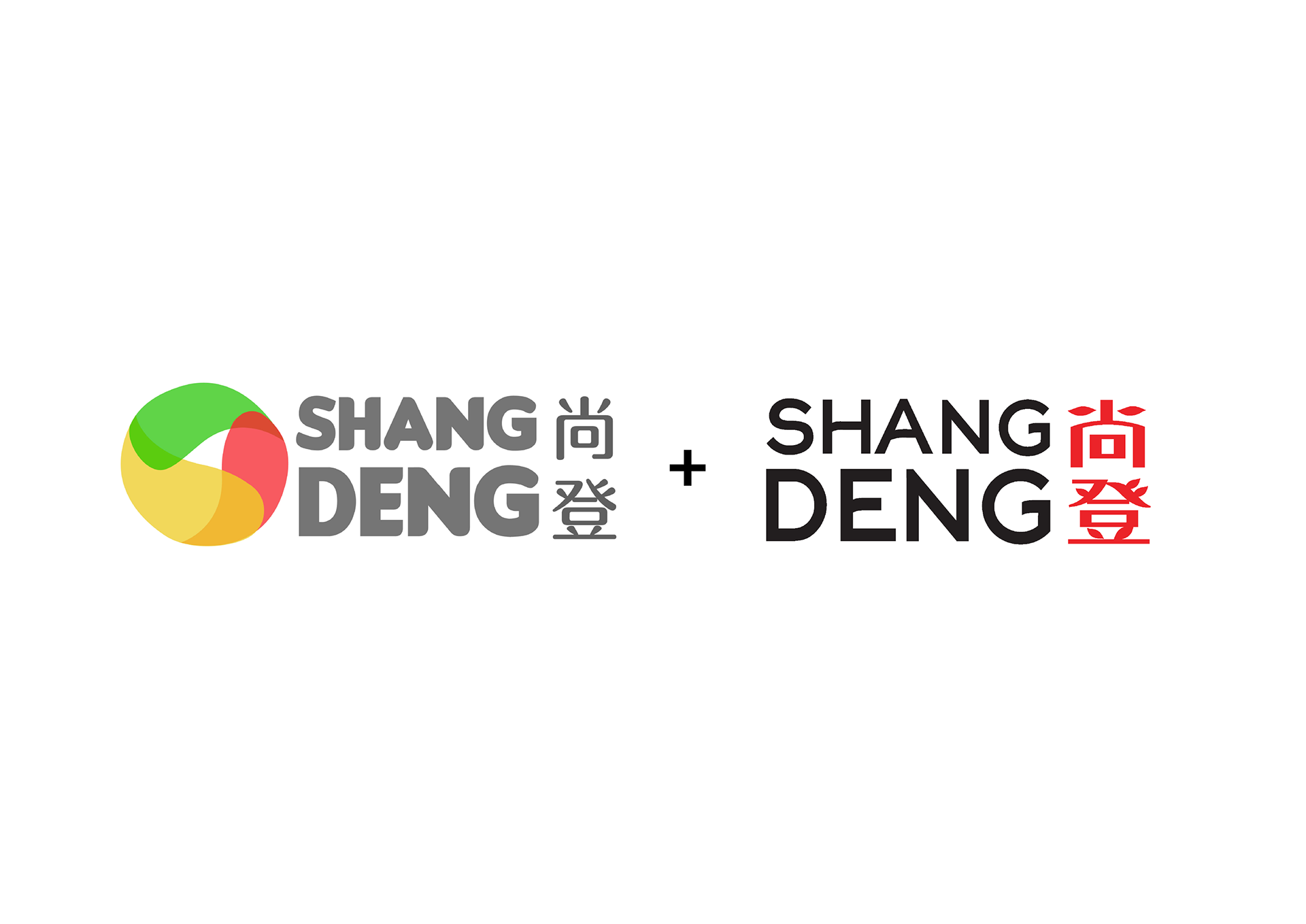
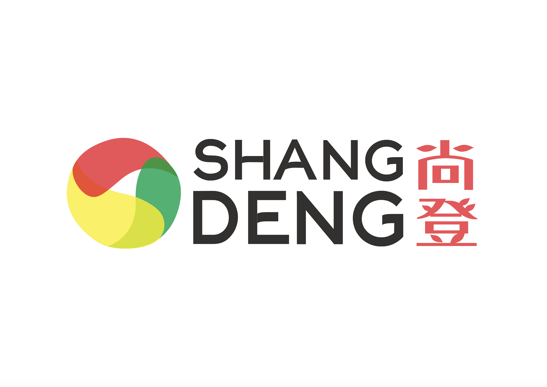
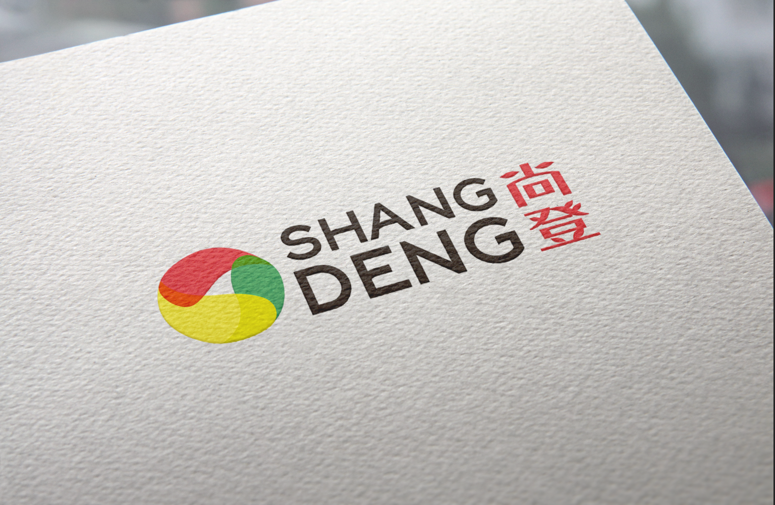
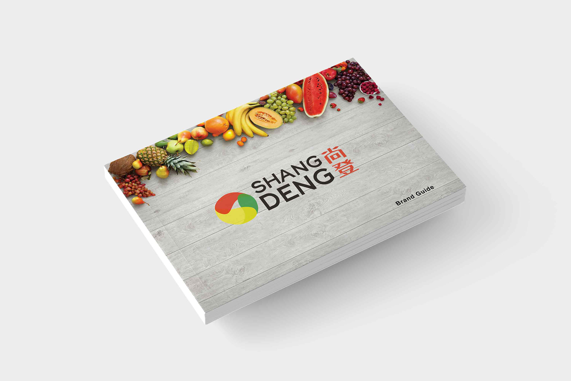
Shang Deng is a fruit company that needs a logo with yellow as the main colour, followed by
secondary shades of red, green and purple (according to their Fengshui*)
*Fengshui is the Art of rearranging objects or elements to achieve balance.
The icon represents a generic fruit and contains an anti-clockwise movement, while the fonts
(specifically the Chinese word “尚”) represent a human's face, bringing prosperity to the business.
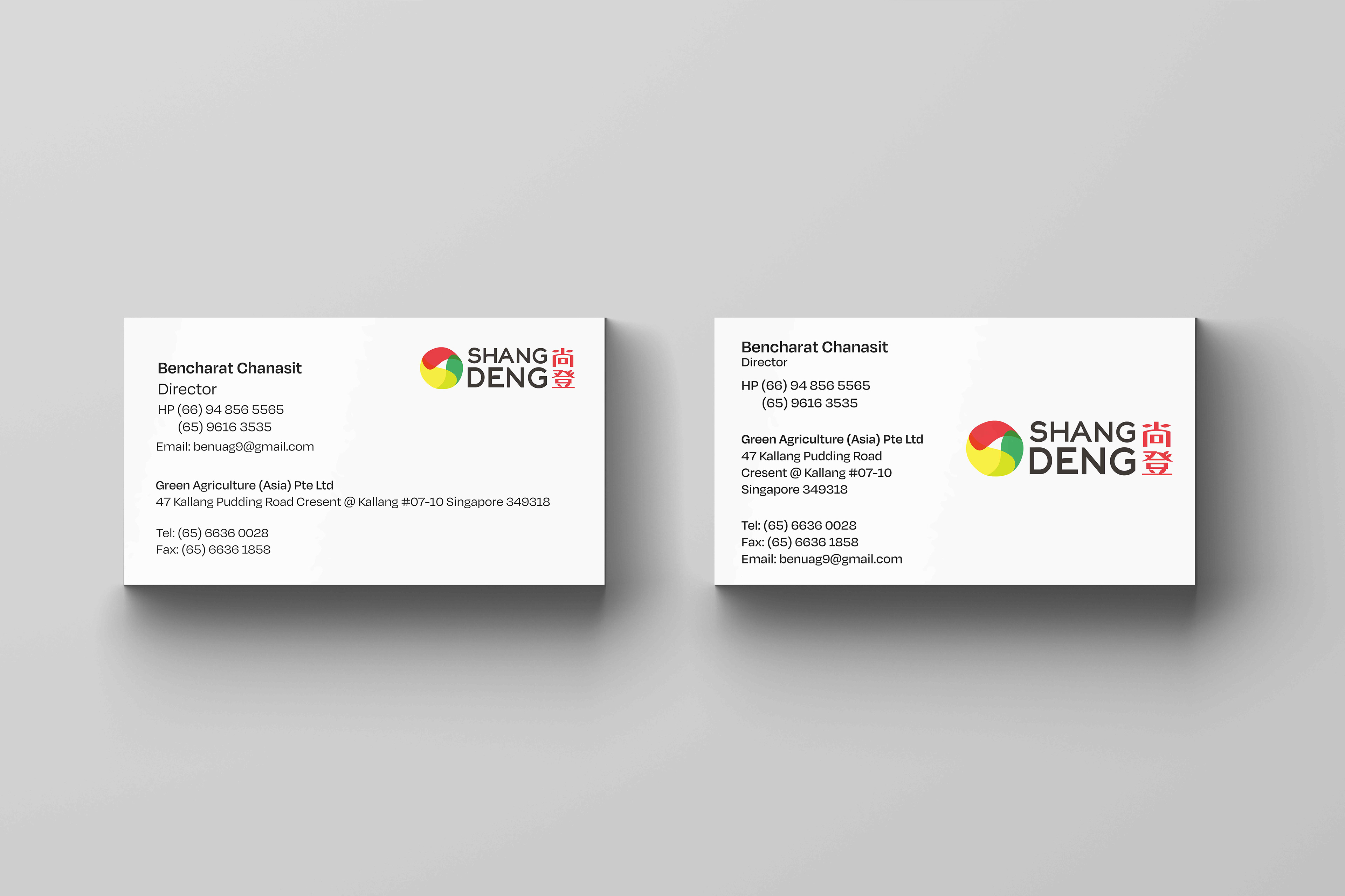
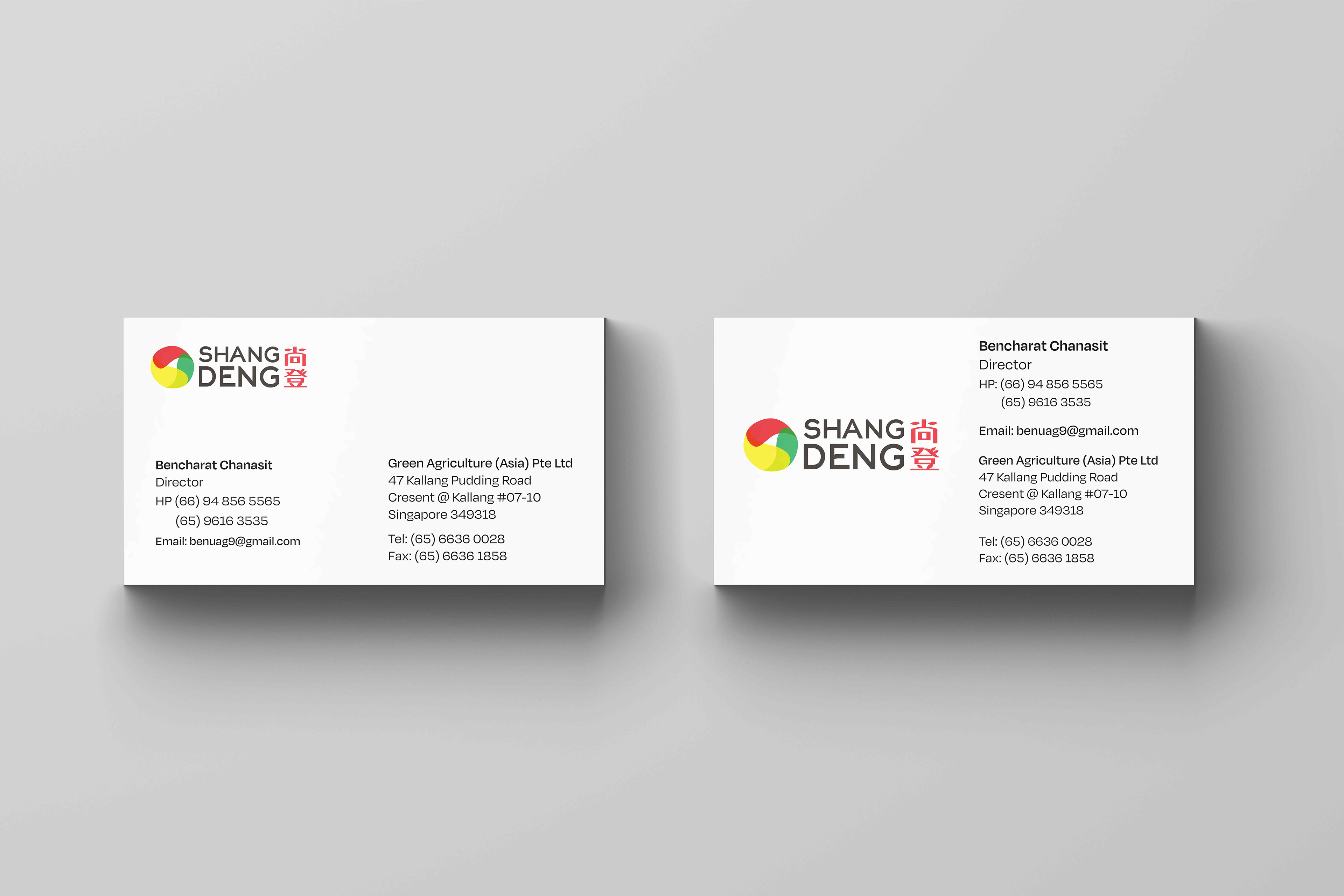
Business Cards
Brand Guide
Logo Animation
Skills:
Research, Conceptualization, Branding